Get Started


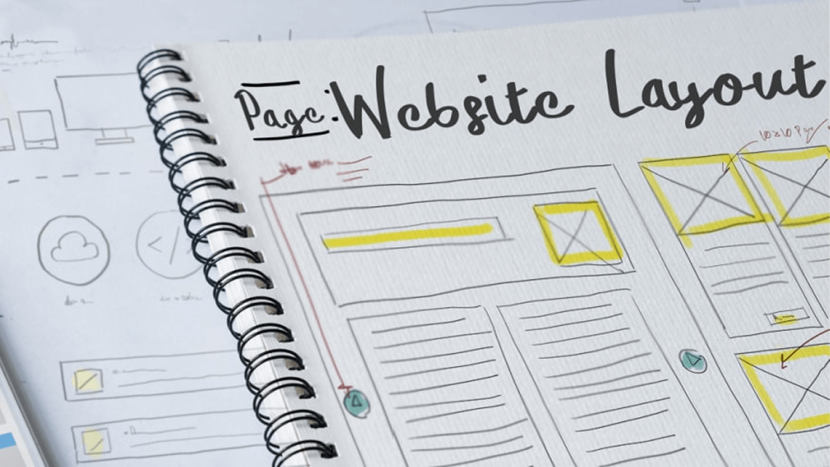
Key Takeaways
Adhere to WordPress Coding Standards for success. Following established coding standards ensures security and compatibility with WordPress updates.
Choose plugins and themes with frequent updates and high user satisfaction. Regular updates indicate compatibility with the latest WordPress versions and better support.
Regularly update WordPress, plugins, and themes for site integrity. Maintenance updates are crucial for security and performance.
Implement security measures like strong passwords and security plugins to protect your website. Prevent unauthorized access and potential threats to your site.
This article explains the importance of following WordPress Best Practices as a developer.
Learn how to write and structure your code properly, test it against WordPress Core standards, and best practices for site creation and management in our developer starter guide. Most importantly, gain tangible insights for how to implement these strategies and practices on your own websites.
Best WordPress Practices for Beginning Developers
If you are new to the WordPress world as a developer, there are some best practices that will make your life easier. Below we cover some of the “need to know” practices as you embark on this new journey. Adhering to these best practices will help you later down the line as you build upon your WordPress development skills.
Use WordPress Site/Home URLs
In WordPress, you must configure which domain should be used by your website using a site_url() and home_url(). While WordPress has a wp-config.php file where you can hardcode your website’s URL, it is way easier to use the native way. In your WordPress Admin Dashboard (/wp-admin/) you can navigate to Settings > General and edit your WordPress Address (URL) and Site Address (URL) fields. These fields should match, and should begin with http:// or https://.

Adhere to WordPress Coding Standards
The WordPress community is a rich community of developers who have worked tirelessly to make it the success it is today. These developers have learned through their own trial and error, and have put together coding standards to ensure the best success and security. If you are creating a plugin or theme via PHP, check out the PHP Coding Standards for WordPress to get started.
And if you plan on developing with JavaScript, you can look to the JavaScript Coding Standards for WordPress. Doing so will set you up for success later on, as you hone your WordPress skills further.
Choose Plugin and Theme Developers Who Care
When setting up your site, you will undoubtedly need to choose which 3rd party plugins and theme to use. It is best to choose a plugin or theme that is updated frequently and has high satisfaction ratings. Frequent updates mean the developer is interested in keeping their work compatible with the latest versions of WordPress. It also means they are more likely to help if you encounter conflicts with their code!
Use WP Engine’s Smart Plugin Manager to keep your environments secure and automatically updated.

Looking at the user base is a good indicator for success as well. If there are thousands of active installations of the plugin or theme, it’s more likely that people have also used it successfully.
Always Be Updating
WordPress typically releases updates many times per year. Oftentimes, between major updates there will be maintenance/security updates as well. Not to mention, good plugin and theme developers will also release improvements and maintenance/security updates often. These updates are important to the integrity of your site! Be sure to login at least once per month to check for any available updates and run them.
If you want to play it safe, it’s best to create a development or staging instance for testing first. Then you can run the updates in this testing environment first, to ensure there are no issues.

Stay Secure
It’s best practice to take some preventative security measures on your website(s) as well. There are many users, bots, and services on the internet that might attempt to access your site in a way you don’t want. Unwanted access could mean spam login attempts, spam comments, or even malicious bots that generate tons of traffic in an attempt to take your website down. There are a few simple ways to prevent security issues:
- Pick a secure Username and Password. Don’t use easy-to-guess Usernames like “Admin,” and ensure your password is over 10 characters and a mix of numbers, letters, and special characters.
- Use a Captcha or other filtering method on any submittable form. This helps ensure a bot or spammer can’t easily send repeated requests to these forms, which is one of the most common spam methods.
- Use a plugin or service for additional security. There are comprehensive security plugins available like Solid Security or All-In-One Security & Firewall which cover your website from multiple vectors. These plugins keep track of fake login attempts, allow blacklisting and whitelisting, log user activity, and block brute force attackers. You can also configure a firewall like Sucuri WAF or Cloudflare to mitigate risk of a DDoS attack and control your website’s traffic in a more granular way.
Best Practices for WordPress Site Builders

In addition to the general best practices for developers described above, there are some general rules for success for site builders. In this section we will explain a few rules of thumb when building a site with WordPress.
- Firstly, if you didn’t build or write it, don’t touch it. This simply means you should leave WordPress Core files and 3rd-party plugins as-is. If you update the code of these assets you risk overwriting your custom code when you update it in the future. For instance, if I added some functions to a theme’s functions.php file, the next time I update the theme I risk overwriting that file. Instead, I should create a “child theme” to accomplish this.
- Add custom functions via a site-specific plugin. While many guides will guide you in how to create a WordPress child theme, there aren’t many tutorials for creating custom functionality through a plugin. A custom plugin can be used to add specific code snippets to your WordPress site, and can be an easy way to add functionality you’re looking for. For example, you could write a custom plugin to give you a custom post type with the attributes you need. Or you could add a plugin to add a new type of User Role. The benefit of adding these functions as a plugin rather than a theme is that it allows you to switch your active theme without losing the functionality.
- Add custom functions via a child theme. Many times developers will choose to build upon an existing theme rather than building a whole theme as new. This allows the developer the freedom to customize the theme they like to their client, without doubling their workload. To do this, developers must install the original theme, then create a “child theme” version of it. In this way, they can ensure their custom code will not break when the original theme is updated. Creating a child theme is as simple as creating the child theme directory in your /wp-content/themes/ folder, and adding a functions.php file and style.css file there via SFTP. Use the Child Theme guide from WordPress for further instructions.
Best Practices for Writing Code in WordPress
This section is exclusively for those developers who are writing code for WordPress. Below we will cover best practices when developing code for WordPress, including why it is beneficial.
Readability
When writing code for WordPress, remember that you aren’t just writing code for yourself. Your code should be readable by any developer. That means adhering to normal spacing and grouping patterns. As WordPress says in their coding standards, “When in doubt, space it out.”
Reliability
Beyond being easy to comprehend, your code should also adhere to WordPress standards, as well as your own team’s standards for excellence. Reliable code is code that is structured consistently. That means handling similar actions in a similar way with your code, based on decisions made by your team. It also means keeping similar naming conventions for files and functions. For the best reliability and insurance that your code won’t break when WordPress updates, make sure the way you call classes, functions, and hooks is in alignment with WordPress core.
Flexibility
Last, ensure that your code is flexible enough to be edited in the future. This means using relative URL paths wherever possible, and leaving room to grow in the future. This means if your URL changes, you won’t be stuck having to edit all the code that calls that specific URL. And ensuring you are structuring your code and content in an accessible way also paves the way to expand on this accessibility later on.
Best Practices for Structuring Code in WordPress
As a developer, you know that structuring your code can sometimes be half the battle. Learning best practices for structuring can be instrumental in keeping your code readable, searchable, and consistent. In this section we will cover general structure rules for WordPress.
File and Directory Structure

Within WordPress, it’s important to understand the default file and directory hierarchy. Understanding this structure allows you to place your code in the right location. In the root directory of your website, there will be a few configuration files. The index.php file will be the homepage of your website. The wp-config.php file will fill in important configuration settings for WordPress. And the .htaccess file will give your web server configuration rules. Specifically, the .htaccess file must have the default WordPress rules.
Within the root directory there are also some important directories:
- wp-admin includes the WordPress core files needed to power the WordPress Admin Dashboard for your website. These files should not be edited.
- wp-includes contains most of the WordPress core files pertaining to core functionality that makes your site tick. These files should not be edited either.
- wp-content holds all content provided by users that isn’t saved in the database including plugins, themes, and items that have been uploaded to the media folder.
And within a plugin, it’s best practice to follow the recommended plugin directory structure for your files. This will help you and others working on your project to keep similar files together.

Template Hierarchy
Another important aspect when developing for WordPress is understanding the template hierarchy. The theme template hierarchy will help you determine which template WordPress will choose when building a page or post. WordPress searches through its default template hierarchy to determine which template to use for each post. WordPress will search until it finds a file matching the name of the template. If there are multiple files matching the name of the template, it will use the first one in the template hierarchy.
Separation and Spaces
While functionally some spacing decisions in code are not any different than others, they can make a difference in terms of readability. With that in mind, the uniform way to space your PHP code is outlined in the WordPress PHP Coding Standards. The general rules when it comes to spacing are:
- Spaces after commas.
- Spaces after beginning and before closing parentheses unless otherwise specified
- Only include spaces around array items if it’s a $variable.
- Remove whitespace at the end of your code
- No closing PHP tag is preferable
And there are more spacing rules in the guide linked above! Coding with these uniform standards will ensure your code is up to par and easy to read.
Design Best Practices
WordPress also has coding standards for the design of your website! You can view their theme handbook, as well as the CSS coding standards for a thorough guide. While WordPress has very few limitations surrounding your website’s appearance, they do have recommendations for the structure of your CSS. Below are the generally accepted rules of CSS code:
- Use tab to indent rather than spaces
- Two lines between sections of CSS
- Selectors should be listed on their own line, ending in a comma or brace

- Name selectors using lowercase words separated by a hyphen
- Use hex codes for colors of properties
- Properties should be followed by a colon and a space
- Comment liberally for context
You can find many more guidelines for style and CSS in general in the guide linked above! When you code according to WordPress standards, it helps your team work together and facilitates understanding. And when you add context clues with many comments, it means the intention and purpose of your code will last far longer than your memory of it will.
Testing Code in WordPress
It’s not often that you get the development of a new feature, plugin, or child theme exactly right the first time. One thing that can facilitate the trial and error of development is to employ Test Driven Development (TDD) methods. The idea behind Test Driven Development is to write a test before you’ve written any code. Then, write just enough code to make that test pass successfully. As you add to the code to add more functionality, add more tests first. In doing so you will save yourself the time of building larger tests with potential holes in the future.
A very handy tool to assist with WordPress development and testing is Codeception. Codeception is unique in that it provides Functional WordPress Tests, Integration Testing, and User Acceptance Testing. Using these tools you can test your code against WordPress standards, ensuring a positive experience for your end users.
In an ideal development workflow, your team can use Test Driven Development methods within an Agile development system. This means allowing your team members to “check out” code from your central library, make changes, commit it back into the library, and regularly deploy those changes to your website. You can learn more about Agile Development for WordPress in our Whitepaper.
Get Support for More Common WordPress Questions with WP Engine
When you host your websites on the WP Engine, your plan comes with 24/7/365 support from our team of WordPress hosting experts. And your plan will also include staging and development environments in which to test your code! A site with multiple environments can unlock powerful developer workflows for your team. Curious to learn more?