Get Started


Key Takeaways
Mobile-friendly sites are crucial for user experience and SEO. Over 61% of Google searches are on mobile, and Google rewards mobile-friendly sites in search results.
Testing WordPress for mobile friendliness is essential. Google offers tools to assess mobile design and ensure responsiveness across various screen sizes.
Responsive WordPress themes and plugins are key for mobile optimization. Updating themes and plugins, or creating custom ones, can enhance site performance on mobile devices.
Consider creating a responsive WordPress theme for a tailored mobile experience. Starting from scratch or using tools like Local can help in designing a site optimized for mobile viewing.
It’s no secret that mobile-friendly WordPress sites are the new norm, but despite how common they may seem, it can still take a little work to create a beautiful, responsive site. This guide will help you understand why it’s important to have a mobile-friendly site, how to build one on WordPress, and introduce you to the best tools to create a responsive site.
We’ll look at all the important elements of WordPress‘ mobile friendliness, like:
Ready? Let’s dive in!
1. Why are mobile-friendly sites important?
In Q4 2019, 61% of Google searches took place on a mobile device. That means that over half the population is turning to phones and tablets over traditional desktop devices, so in order to keep up with them, your website needs to be ready to display on any screen size. A mobile-friendly design makes for a positive user experience and will help your users find what they’re looking for while on the go.
Besides UX, there’s another important reason your site should be mobile-friendly: Google. Starting in 2015, Google implemented a major overhaul of its search algorithm to reward sites that are deemed “mobile friendly.” The change came down to one crucial data point: whether or not your website is responsive.
This means that if your site reads well on mobile devices, it’s going to perform better in search results than sites that don’t. That’s a pretty sweet perk if you’ve done the work to create a mobile-friendly site! But it can also hurt your site’s traffic if it’s not quite up to the task of displaying on smaller screens.
Luckily, if your WordPress site isn’t mobile friendly yet, there are plenty of tools to help you get up to speed and build a fully-functioning, responsive site. The first step? Benchmark your current design.
2. How to test WordPress for mobile friendliness
Your website may look great on one mobile device (like your own personal cell phone), but you really need to test it on a wide range of screen sizes to know if it’s truly responsive. Even if you happen to have a whole bunch of old phones lying around, that can be a time-consuming process to test it on every screen.
To simplify things, Google has gifted us all with a free mobile-friendly testing tool that will tell you whether your site qualifies as “mobile friendly” or not. Just enter your site’s URL for a quick assessment of your site’s mobile design. If your website is fully optimized for mobile devices, you’ll get an enthusiastic little success message that looks like this:
If you’re seeing red, you’ve got a little bit of work to do. (We’ll get to that in a second!)
Google also released a Mobile-Friendly Test API that allows you to test URLs with automated tools. The benefit of this is that you can quickly test more pages, but you can also monitor the most important pages on your site without having to manually turn to the browser tool all the time. Score!
Once you’ve used Google’s mobile-friendly tool to benchmark your site, it’s time to start making improvements. Let’s start with your WordPress theme.
3. Why use (or create) a responsive WordPress theme
If you’ve recently installed a new WordPress theme, there’s a decent chance you’re okay in this department. If your theme has been around for a while though, it might be time for a little update.
First things first: Double-check your WordPress version and current theme version. If there are pending updates, start with those. I can’t speak for every theme out there, but some updates will contain mobile-friendly elements and may be enough to fix your problems.
If updates don’t do the trick, it’s probably time to look for a new theme or consider creating your own. Let’s explore both options.
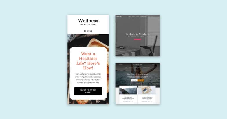
The best mobile-friendly WordPress themes
Realistically, a lot of WordPress themes these days are responsive—it’s probably rarer for a theme to not be mobile-friendly. That being said, before purchasing a theme, double-check that it displays well on any screen size. Test out the demo site, scale your browser window, and read any reviews you can find to look for experience from real users.
If you’re happy with what you see, go for it! But if something doesn’t look right, steer clear. Even if you thought it was the perfect match, there are so many WordPress themes to choose from that you should have no problem finding a better, truly mobile-friendly option for your site.
If you’re looking at free themes, be sure to see what it looks like with your own content in place—as you surely know, things don’t always look quite the same, so make sure it displays your content the way you’d want on mobile.
Not sure where to start? When you host your WordPress site on WP Engine, you’ll get access to StudioPress themes (including the Genesis Framework!) free with your plan. These themes are fully responsive so they’ll look great on any device. Plus you can easily swap between them (instead of feeling stuck with the “the one” premium theme you decided to purchase).
How to create your own responsive WordPress theme
If you’d rather go the DIY route to create a mobile-friendly site, be sure to start from scratch or in a test environment—you should never make drastic changes like that on your live site.
We’d recommend using Local to spin up a local WordPress site right on your machine. This free app will allow you to experiment to your heart’s content while never breaking your current site (which is essential when going through a redesign). You can even import your existing site into Local, so you only need to start from scratch if you want to.
There’s also a feature called Live Links, which generates a shareable URL to the local site. This allows you to send it off to a client or pull it up on your phone, so you can easily test how the site looks on a mobile device.
If you create a child theme based on a responsive parent theme, you’re going to be in pretty good shape. If you’re starting from a totally blank slate and creating your own theme, just be sure to use media queries to establish boundaries for the design, and think elements through one at a time.
Ask yourself how images should scale, what the navigation should look like, and if any of the content will hide on a mobile device. Here are a few tutorials that can help you out:
- How to create a responsive navigation menu in WordPress
- 7 best practice tips for responsive web design
- Working with responsive images in WordPress
4. Why use responsive plugins
Plugins add functionality to your WordPress site, so they don’t always add anything visually to the front-end. But in the event that they do add a physical element to your site (like a widget or CTA button) make sure it scales well on all screen sizes, or at least gives you the option to disable it on smaller screen sizes.
For example, a sidebar widget is a wonderful addition to a desktop site, but if it dominates the mobile design or doesn’t scale down, it’s not going to make for a very great user experience.
Like themes, just pay attention to the features of a plugin, and try to read reviews or find a demo before purchasing one. And whenever you activate a new plugin, remember to do a quick quality check of your site to ensure it’s scaling correctly across screen sizes.
As long as you’ve got a responsive theme and plugins that behave well on mobile, your site is going to be in really good shape for displaying on smaller screens.
5. Avoiding pop-ups for mobile devices
If you’re trying to build an email list with your WordPress site, you likely have a few opt-ins on your site. Most email opt-in forms work just fine on mobile devices (assuming they scale and are easy to use).
Pop-ups, however, are a different beast. Google has started penalizing sites with intrusive interstitials, aka opt-ins that cover the content of a site. This includes pop-ups (whether they display immediately or after a user has been on the site for some time) and any other type of opt-in that a user must dismiss before accessing the content on the page. You can read all about Google’s stance on the matter here.
To keep your WordPress site mobile friendly and following best practices, avoid pop-ups on your mobile design. How you go about that will depend on the service powering your opt-ins, but most providers should have an option to disable intrusive pop-ups on mobile devices.
6. Strategizing for responsive media
Whether you’re working with a portfolio site, a daily blog, or an eCommerce site, an important piece of the responsive puzzle is to consider the media on your site. That large background image on your homepage might look great on a desktop machine, but if it doesn’t scale correctly, it could lose all context and lead to a difficult viewing experience on a phone. So rule number one to responsive media? Think about how things scale.
If scaling isn’t actually the best solution for your site, you could also consider hiding certain elements when your site is loaded on a mobile device. This would help simplify the experience and get users to the most important content faster.
Finally, you also need to keep in mind the file size of the media you’re including on your site. Not only will this improve the mobile experience, but the desktop load time, too!
Media files are often some of the largest on a website, which often makes them the culprit behind long wait times. To help streamline your site and boost mobile performance, try to optimize your images by using the smallest file size you can while still maintaining the quality you need. (For example, maybe your mobile site loads a smaller version of an image than the desktop!)
7. Prioritizing site performance
Page speed has been important for a long time in terms of how your site is ranked in Google desktop searches, but as of July 2018, that’s now also the case for mobile rankings. Pair that with the stat from above that more than 60% of internet searches are using mobile devices, and your site’s performance (on every device) is more important than ever.
Images are a big part of the performance equation, but your code and WordPress host play a big role as well.
When it comes to your code, consider actions like minification (especially if working with a custom theme). Take inventory of all the plugins installed on your site, and deactivate and uninstall any that aren’t needed anymore. Basically, the more organized you keep the elements powering your site, the better off you’ll be.
As for your WordPress host, make sure you’re using a quality partner that includes services like caching technology, CDN, and infrastructure powered by reliable providers like the Google Cloud Platform. If you’re hosting your site on WP Engine, you’re set in all these areas.
Get access to premium (and mobile-friendly!) themes
Save yourself some time (and money!) with WP Engine’s hosting for WordPress sites. Gain access to StudioPress themes and the Genesis Framework, which easily make WordPress more mobile-friendly, saving you time when trying to build a responsive, mobile-optimized site. Plus, WP Engine’s powerful platform will keep your site’s performance optimized, helping those page speeds stay fast and your site ranking well.