Get Started


Key Takeaways
CSS3 Transforms enable smooth element transitions. Transforms like translate, rotate, scale, skewX, skewY, skew, and matrix offer diverse ways to manipulate elements for engaging animations.
CSS3 Transitions control animation speed and effects. Transition-property, duration, timing-function, and delay allow precise customization of element state changes.
Animation planning is crucial for meaningful user experiences. Over-animation can detract from user engagement; animations should convey purpose and enhance usability.
Leaders should evaluate their current workflow to identify gaps. Assessing animation strategies and user experience enhancements can drive better engagement and interaction.
Editor’s note: This guest post was written by Abbey Fitzgerald a UX software engineer and web designer who loves the art of crafting code.
Interesting animations can be created with CSS3 by using transforms and transitions. Transforms are used to make an element change from one state to another. Examples would be rotating, moving, skewing, and scaling elements. Without a transition, an element being transformed would change abruptly from one state to another. To prevent this, a transition can be added so you can control the change, making it look smoother.
How to use CSS3 transforms
There are a few types of commonly used transforms. We’ll focus on 2D examples for this tutorial, but it’s good to be aware that cool things can be done with 3D transforms, too. (Once you’ve mastered 2D, 3D will be much easier!)
In the following examples, the original rectangles are in a darker green and the transformed are a bit more transparent.
Translate
The translate() method moves an element from its current position to a new one.
With this code, the adjusted rectangle is moved 40 pixels to the right, and 100 pixels down from the current position.

 -ms-transform: translate(40px, 100px); /* IE 9 */
    -webkit-transform: translate(40px, 100px); /* Safari */
    transform: translate(40px, 100px);
Rotate
The rotate() method rotates an element clockwise or counter-clockwise by the specified degree value. This code rotates the rectangle clockwise by 40 degrees.

-ms-transform: rotate(40deg); /* IE 9 */
    -webkit-transform: rotate(40deg); /* Safari */
    transform: rotate(40deg);
Scale
The scale() method increases or decreases the size of an element (according to the parameters given for the width and height). In this example, the adjusted rectangle is two times larger than its original width and three times larger than its original height.

-ms-transform: scale(2, 3); /* IE 9 */
    -webkit-transform: scale(2, 3); /* Safari */
    transform: scale(2, 3);
SkewX
With skewX(), only the x-axis will be affected. This rectangle is skewed 30 degrees along the x-axis:

  -ms-transform: skewX(30deg); /* IE 9 */
    -webkit-transform: skewX(30deg); /* Safari */
    transform: skewX(30deg);
SkewY
This is the same idea, but on the y-axis. The skewY() method skews an element along the y-axis by the defined angle. This rectangle is skewed 30 degrees along the y-axis.

-ms-transform: skewY(30deg); /* IE 9 */
    -webkit-transform: skewY(30deg); /* Safari */
    transform: skewY(30deg);
}
Skew
If you want to skew both the x and y-axis, this can be done in one place. The skew() method skews an element along the x and y-axis using the specified angles. The following example skews the rectangle element 30 degrees along the x-axis and 20 degrees along the x-axis.

-ms-transform: skew(30deg, 20deg); /* IE 9 */
    -webkit-transform: skew(30deg, 20deg); /* Safari */
    transform: skew(30deg, 20deg);
Matrix
This is where things get interesting, but also more efficient in the right situation. If you are doing a lot of transforms and don’t want to write them out all individually, these 2D transforms can be combined with the matrix() method.
Here’s a basic outline to follow:
matrix(scaleX(),skewY(),skewX(),scaleY(),translateX(),translateY())
Just a heads up, it takes some research to come up with the values in the matrix. Here is a helpful guide to get started.

To make this example, here are the matrix values:
  -ms-transform: matrix(2, -0.3, 0, 1, 0, 0); /* IE 9 */
    -webkit-transform: matrix(2, -0.3, 0, 1, 0, 0); /* Safari */
    transform: matrix(2, -0.3, 0, 1, 0, 0);
How to use CSS3 transitions
Now that transforms have been covered, it’s important to note that they are frequently used with transitions. This will make more sense in the following design examples.
It’s good to keep in mind that values can be customized to make the transition between two states of an element just how you would like. Think of it as a way to control animation speed when changing CSS properties. One example that you’ve probably come across is if you hover over a button. It’s common to see a “slow darkening” rather than just a quick instant darker color when you hover over it. This “slow darkening” was created with a transition.
If you are specifying a lot of values, shorthand will come in handy. The transition CSS property is a shorthand property for transition-property, transition-duration, transition-timing-function, and transition-delay.
Transition details
The transition-property specifies the CSS property where the transition will be applied, since you can apply a transition to an individual property. Examples of applying a transition to an individual property would be on a background or a transform. If you would like to target all the properties on the site, the transform property can be set to all.
The transition-duration is helpful to have the changes in a property to take place over a specified time rather than immediately. You’ll see seconds and milliseconds as the possible values.
transition-duration: 7s;
transition-duration: 120ms;
transition-duration: 2s, 3s;
transition-duration: 10s, 30s, 230ms;
The transition-timing-function CSS property lets you establish an acceleration curve, so that the speed of the transition can vary over its duration. There are many options to experiment with.
transition-timing-function: linear|ease|ease-in|ease-out|ease-in-out|step-start|step-end|steps(int,start|end)|cubic-bezier(n,n,n,n)|initial|inherit;The transition-delay is pretty self-explanatory. A specified value sets the number of seconds or milliseconds to wait before the transition effect will start. Initial will set the property to its default value. If inherit is specified, this means that it inherits the property from its parent element.
Here are all the properties:
transition-property: background; //all
  transition-duration: 1s;
  transition-timing-function: linear; //other options are ease
  transition-delay: 0.5s;
Here’s the basic shorthand setup for a transition:
div {
  transition: [property] [duration] [timing-function] [delay];
}
The full shorthand sequence:
div {
  transition: background 1s linear 0.5s;
}
Animation planning
Before you create really detailed animations, it’s good to take a step back before creating something totally crazy (especially if it will be in the public on the web). There’s nothing wrong with adding some fun flair, but it’s tempting to over animate. The movement you create should convey meaning and enhance the user experience, not distract from it. With that said, it’s time to get creating!
I do want to call out that there are animated gifs in this tutorial to show the animations. The gifs are on repeat, which wouldn’t typically be done for the designs. The purpose of having them on repeat is for demonstration purposes only.
Moving an image with the CSS transform property
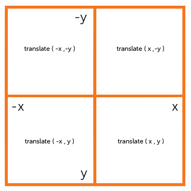
Before we get into complicated transforms and transitions, let’s talk about coordinates on an axis grid. (Heads up: This may bring back memories of graph paper from math coursework.) Coordinates are used to move the image.
X and Y coordinates
Things will look slightly differently than what you may expect. The -y value is above the x axis. HTML and CSS use what’s called an “inverted Cartesian coordinate system,” because web pages start from top-left and read downwards.
Animation one: Basic transform with horizontal movement
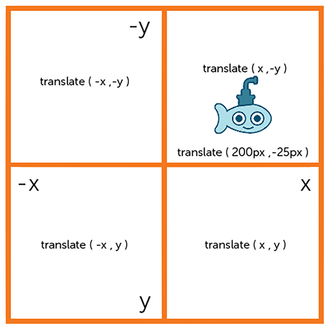
We briefly touched base on translate() and how it can move an element. When put into practice, it can really float your boat, literally. As we learned above, The translate() method moves an element from its current position (according to the parameters given for the x-axis and the y-axis).
The first project will be moving a submarine graphic. Submarines need to come up for air once in awhile, so we’ll carefully style it with translate().
To move it from its initial position using transform: translate(x,y), two new values will have to be specified. To make the submarine move right and up, the x value should be positive and the y value should be negative. If the y value is set to 0, it would move only to the right and not up.
Submarine going up for air with transform()
In this example we are going to move the object 200px to the right and 25px up. The syntax is transform: translate(200px,-25px); and the object will move on the hover of .underwater. By creating the styles for the movement in .underwater:hover .move-right, the action will happen on hover.
Here is the starting HTML:
<div class="underwater">
  <div class="object submarine move-right">
  	<!-- image is set as a background image on submarine -->
  </div>
</div>
See this on Codepen.
It really does not take a lot of CSS to make this basic animation:
.underwater {
  position: relative;
  min-height: 600px;
  background-color: #4fc3da;
}

.underwater:hover .move-right{
    transform: translate( 200px ,-25px );
    -webkit-transform: translate( 200px ,-25px ); /** Chrome & Safari **/
    -ms-transform: translate( 200px ,-25px ); /** Firefox **/
}

.submarine {
  height: 200px;
  background: url("little-submarine.svg") no-repeat;
}

.object {
  transition: all 2s ease-in-out;
    -webkit-transition: all 2s ease-in-out; /** Chrome & Safari **/
    -ms-transition: all 2s ease-in-out; /** Opera **/
}
As you can see, our coordinates would fall in the top right square. On hover, the submarine moves up to the new coordinates because of the transform.
Things look smooth because of the transition. The transition-duration was set to 2sec, which isn’t too fast for this animation. The transition-timing-function was set to ease-in-out which gives it a slower start and end. If the duration time was increased to something larger, this would be very apparent.
Basic animation two: Horizontal movement with keyframes and animation
Transform is being used a little differently in this example. Keyframes and the animation property will be utilized to create the next animation.
Keyframe Basics
Inside @keyframes is where you define the styles and stages for the animation. Here’s the example we will be using, which will help give a “fade in while moving downward” effect:
@keyframes fadeInDown {
  0% {
    opacity: .8;
    transform: translate(0, 0);
  }

  100% {
    opacity: 1;
    transform: translate(0, 30px);
  }
}
The transform values are incorporated into the keyframes. The original placement is set at 0%, and at 100%, the position will move down by 30px.
Animation basics
To use CSS3 animation, you specify keyframes for the animation.
Like designed above, @keyframes hold what styles the element will have at certain times.
Whenever you do this, make sure to give the animation a descriptive name. In this case, we’re using fadeOut. Any class that includes the fadeOut will be applied. In the stages of the animation, the “from” is set to 0% and “to” is set to 100%. This example is pretty simple with just the two stages, but there can certainly be more steps added in between.
Specific actions with animation subproperties
The animation property is used to call @keyframes inside a CSS selector. Animations can and will often have more than one subproperty.
Keyframes define what the animation will look like; subproperties define specific rules for the animation. Timing, duration, and other key details of how the animation sequence should progress are all including in subproperties.
Here are a few examples of animation subproperties:
- Animation-name: Name of the
@keyframesat-rule, which describes the animation’s keyframes. The namefadeOutin the previous example is an example ofanimation-name. - Animation-duration: Length of time that an animation should take to complete one full cycle.
- Animation-timing-function: Timing of the animation, specifically how the animation transitions through keyframes. This function has the ability to establish acceleration curves. Examples are
linear,ease,ease-in,ease-out,ease-in-out, orcubic-bezier. - Animation-delay: Delay between the time the element is loaded and the beginning of the animation.
- Animation-iteration-count: Number of times the animation should repeat. Want the animation to go on forever? You can specify
infiniteto repeat the animation indefinitely. - Animation-direction: This determines whether or not the animation should alternate direction on each run through the sequence or reset to the start point and repeat itself.
- Animation-fill-mode: Values that are applied by the animation both before and after it has executed.
- Animation-play-state: With this option, you are able to pause and resume the animation sequence. Examples are
none,forwards,backwards, orboth.
.fadeInDown {
    -webkit-animation-name: fadeInDown;
    animation-name: fadeInDown;
    -webkit-animation-duration: 4s;
    animation-duration: 4s;
    -webkit-animation-timing-function: ease-in-out;
    animation-timing-function: ease-in-out;
    animation-iteration-count: 1;
}
Here is what it would look like written in shorthand:
animation: 4s ease-in-out 1 paused fadeInDown;Here is the HTML structure:
<div class="underwater">
<div class="content-wrap fadeInDown">
<div class="submarine"></div>
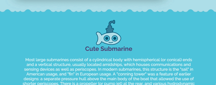
<h2>Cute Submarine</h2>
<p>Text here.</p>
</div>
</div>The class of fadeInDown is making the submarine and content move up and down.
Making the animation smoother by adjusting keyframes
With a few more keyframes, we can make the animation much smoother.
@keyframes fadeInDown {
  0% {
    opacity: .8;
    transform: translateY(5px);
  }

  25% {
    opacity: .9;
    transform: translateY(15px);
  }

  50% {
    opacity: 1;
    transform: translateY(30px);
  }

  75% {
    opacity: 1;
    transform: translateY(15px);
  }

  100% {
    opacity: .9;
    transform: translateY(0);
  }
}
See this on Codepen.
Adjusting timing of the animation
Adding more keyframes helped smooth out the animation, but we can add a little more interactivity with more keyframes and a text delay on the div that contains all the text. It is a fun effect to to have the submarine bounce off the text, so having the delay line up with the movement of the submarine allows for that.
The HTML will have the effective classes applied:
<div class="underwater">

    <div class="submarine move-down fadeInDown"> </div>

    <div class="moving-content move-down text-delay fadeInDownText">

      <p>Text goes here.</p>

    </div>

</div>
And here is the updated CSS that allows for the interactive animation:
@keyframes fadeInDown {
  0% {
    opacity: .8;
    transform: translateY(0);
  }

  25% {
    opacity: 1;
    transform: translateY(15px);
  }

  50% {
    opacity: 1;
    transform: translateY(30px);
  }

  75% {
    opacity: 1;
    transform: translateY(15px);
  }

  100% {
    opacity: 1;
    transform: translateY(0);
  }
}

@keyframes fadeInDownText {
  0% {
    opacity: .8;
    transform: translateY(0);
  }

  100% {
    opacity: 1;
    transform: translateY(35px);
  }
}

.fadeInDown {
    -webkit-animation-name: fadeInDown;
    animation-name: fadeInDown;
}

.fadeInDownText {
    -webkit-animation-name: fadeInDownText;
    animation-name: fadeInDownText;
}

 .move-down{
    -webkit-animation-duration: 4s;
    animation-duration: 4s;
    -webkit-animation-timing-function: ease-in-out;
    animation-timing-function: ease-in-out;
    -webkit-animation-iteration-count: 1;
    animation-iteration-count: 1
}

.text-delay {
    -webkit-animation-delay: 2s; /* Safari 4.0 - 8.0 */
    animation-delay: 2s;
    -webkit-animation-iteration-count: 1;
    animation-iteration-count: 1;
}
See this on Codepen.
Cubic-bezier progress bar in CSS3 animation
It’s time to celebrate our animation progress by making a progress bar!
All the concepts we’ve covered will come together to create something like this. A progress bar is a very common UI element, so creating something functional like this will help you see how other web elements can be animated.
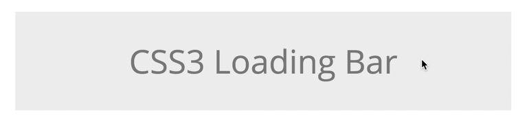
Here is the starting HTML:
<div class="container">
  <div class="row">
    <div class="masthead">
      <p>CSS3 Loading Bar</p>
    </div>
  </div>
 <div class="fast-loader"></div>
</div>
And the CSS to make it come to life:
@keyframes speedSetting {
  0% { width: 0px; }
  100% { width: 100%; }
}

@keyframes progressMotion {
  0% { opacity: 1; }
  50% {opacity: 1; }
  100% { opacity: 0; }
}

.fast-loader {
  width: 0px;
  height: 10px;
  background: linear-gradient(to left, blue,rgba(255,255,255,.0));
  animation: speedSetting 2s cubic-bezier(1,.01,0,1) infinite, progressMotion 2s ease-out infinite;
-webkit-animation: speedSetting 2s cubic-bezier(1,.01,0,1) infinite, progressMotion 2s ease-out infinite;
}
In the first set of keyframes, the width is going from 0 to 100% with a duration of two seconds. The keyframes in progressMotion are controlling the opacity.
CSS bezier curve
The cubic-bezier() function can be used with the transition-timing-function property to control how a transition will change speed over its duration. You’ll see this in the animation. See how it starts a little slower and then picks up the pace?
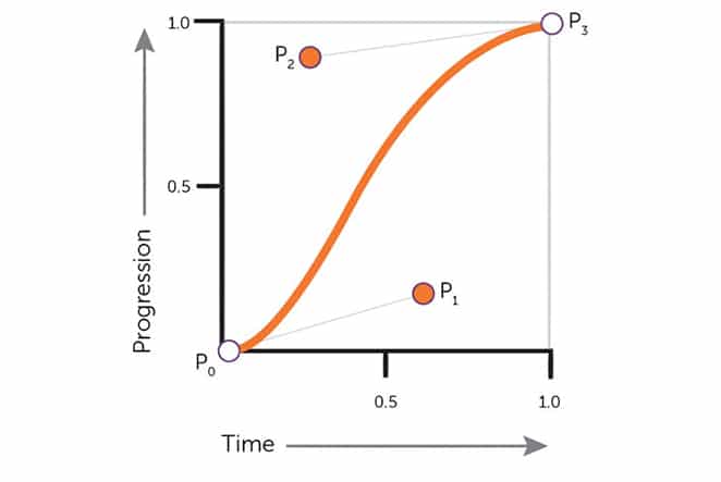
It is helpful to picture a bezier wrapper as a square. The lower left and the upper right are places where key points are, which are the P0 and P3. These are always set to (0,0) and (1,1), which don’t change. However, P1 and P2 can be moved with the cubic-bezier() function if you specify new points with an x or y value.
- x1 is the x coordinate of control point p1
- y1 is the y coordinate of control point p1
- x2 is the x coordinate of control point p2
- y2 is the y coordinate of control point p2
Here are some example values:
x1 = .7
y1 = .16
x2 = .2
y2 = .9
So an example might look like this:
cubic-bezier(.7,.16,.2,.9)The progress bar is a great example of how a bezier can customize the timing of an animation. With transforms, transitions, and many other options, custom animations can easily be created. Hopefully seeing these basic CSS3 animation examples has helped you see what other possibilities there are.
Looking for a smarter way to WordPress? Find out more about industry-leading hosting for WordPress sites, including award-winning 24/7/365 support at WP Engine.