20 Design Elements and Principles Every Designer Should Know
There was a time when design was too controlled. Too patterned. Too safe.
But evolution is inevitable, and designers started to experiment a little more.
From there, designs became bolder and better. Designers started to dig deeper into the science behind their audience’s behavior, allowing them to become flexible to what the market demanded.
Today, design has become more than just patterns and trends. It has become a lifestyle. Something that is carefully weaved into every human reaction and routine. And beneath the intricacies that come with this lifestyle lie 20 different design principles that make this world a more creative, beautiful place to live in.
Let’s take a look at those principles, and tips for harnessing them in your designs.
Lines

Look anywhere around you and you’ll see lines. The edges of your computer screen. The sides of each key on your keyboard. Even the letters on those keys are made up of lines, some of them straight, some of them curved, some of them slanted.
That’s exactly how important lines are. Without them, everything would just blend into each other infinitely, making the world a single blob.
What makes lines even more amazing, aside from the fact that they define everything’s form, is the fact that they also translate into emotions and ideas that solicit equivalent reactions. Put a squiggly line beside a straight vertical line, for example, and you’ll start thinking of order and strength on one side and chaos and confusion on the other.
This can be very useful if you’re prompting your audience to respond to certain calls to action. The moment their moods and emotions have been set, it’s easier to just cruise through your call to action.
Another role that lines play in web design is the fact that they lead the eyes of the audience towards each page’s focal points. For example, strong leading lines under the name of the brand in a sea of other smaller text will help that name stand out.
Scale

Scale defines how you will size different elements in a single design. It basically brings logic into a piece, or takes it away. For example, if you were to draw an ant right next to a dog, it would only make sense that you make the dog a whole lot larger than the ant (unless the design dictates that you veer away from reality).
Scale is also the best way for you to create drama. As hinted above, there will be instances when you will have to step away from realism and create stunning effects by sizing some elements significantly smaller or larger than others.
Scaling is also a great way to emphasize hierarchy. Take movie posters, for instance. Actors with major roles usually have their pictures standing out above the rest, not because they’re taller or bigger than the supporting actors, but because their characters are more important.
Now, let’s say you’re working on something that features a lot of text, and not a lot of pictures. Scaling still proves to be the best way for you to emphasize some details over the others. Statistics, for example, can be scaled up significantly to draw the eyes of the audience straight to that piece of data.
Color

It’s unbelievable how much impact color has on everything. There’s been study after study about color’s effects not only on a person’s moods and emotions but on their reactions and buying decisions as well.
Can you imagine seeing an environmental company using nothing but black and white for their brand? Or a business that wants to exude a professional aura and traditional values using bright neon colors? That, I think, is enough explanation that shows what role color plays in design.
Consistency

When you think about Coca-Cola, do you imagine the colors green or blue? Probably not—your mind automatically jumps to the color red.
This is what consistency is all about.
Designing for a brand is all about consistency. It is all about using the exact same shades, tones, and tints of the exact same color, as well as the exact same font types. Office reports, billboards, banner ads—every single thing associated with the brand should always be consistent. After all, if Coca-Cola changed their color scheme every year or so, do you think it would still bring about the same brand recall that it has now? I think not.
White Space

White space doesn’t necessarily mean that it’s white, but it does always mean the same thing no matter what color it may be. It is the unused space between your elements, that negative space that a lot of designers go crazy about.
To some, all that unused space seems to be such a waste. But wait until you use that space to your advantage by strategically leaving it blank. You can open up a whole new level of creativity that would blow your audience’s minds away.
Don’t believe me? Check out MC Escher’s Sky and Water and you’ll get exactly what I mean.
Symmetry

Did you know that your eyes are naturally drawn to anything symmetrical? This is the concept that brands like Target and Chanel took advantage of, making their logos incredibly memorable.
Symmetry is one thing that brings a sense of balance and order to any design. It may not be that obvious sometimes, but for every great piece of art comes a unique way of forming symmetry to please the eye.
Opacity

A design element’s opacity shows how ‘see through’ it is. It dictates how transparent everything is. Anything that has lower opacity is basically lighter, while elements that have higher opacity are more solid to the eye.
Opacity can help you lay different elements on top of each other without completely eliminating the presence of those underneath. It is also used to add a sense of movement to an image.
Texture

Without texture, any design could look blank and plain. Add some texture in and the design comes alive, making it seem like it’s ready to pop out of the screen or the surface it’s printed on.
This does not mean that every piece of design requires texture. There will always be design projects that would look better when they’re clean and sharp. However, there will also be instances where a little texture wouldn’t hurt.
You can jazz up your design’s texture by adding a background that adds depth to the surface. You can also try embossing some elements.
Balance

Balance may sometimes be confused with symmetry, but they are actually two different things. When things are symmetrical, each element might end on the same margin or there might be the same number of elements on either side of a page. While this usually results in a sense of balance, you can also achieve that feeling without using a symmetrical design.
Say, for example, you’d like to design an about page with some text and an image. You can find a sense of balance with a two-column layout even though the text is not an identical element to the image.
Balance is just something that makes a piece of design look complete. When an image is unbalanced, it may look half-baked, or worse, uninspired.
Hierarchy

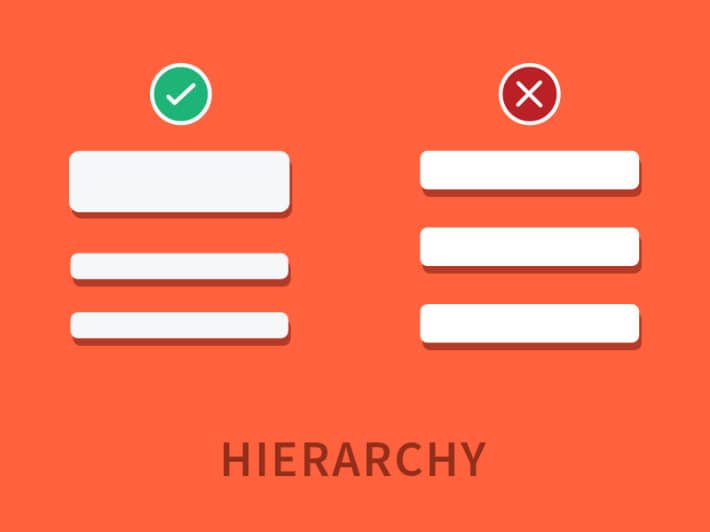
Hierarchy shows which elements are more important over everything else. This does not mean that the elements at the end of the hierarchy (the bottom feeders, so to speak) are things you can do without. After all, without the elements on the other end of the hierarchy, you wouldn’t be able to get the amount of impact that you’re aiming for.
Hierarchy can be expressed in so many different ways aside from scaling. You can use brighter colors for those at the top of the food chain, with the color getting lighter as you move further down.
Contrast

Contrast is the rule of opposites. It basically distinguishes light from dark, big versus small. For designers who are always aiming to make an element or two pop out of their design, contrast is usually one of the approaches they use.
But contrast goes way deeper than just aesthetics. Contrast also affects readability. Use two colors that are almost the same for the text and the background and you’ll probably scratch your eyes out trying to read what the text says. By using two colors with a high contrast, your eyes will immediately see what they are supposed to see.
Framing

See how a frame puts a boundary around pictures you put in it? That’s exactly what framing is for. It basically shows you what should and should not be part of the picture.
Box outlines, margins—all these are forms of framing. It also allows you to highlight certain elements over the others, like a single quote in the middle of a page filled with text.
You can also be creative and use other things for your frame aside from the usual lines and margins. For example, a beach-themed poster could use shells lined up around the text to effectively frame them.
Grid

Trying to align things on a blank space can be tough, which is why grids are very important in design.
Grids help designers align and arrange elements. A perfect example of this would be the columns on a magazine page or a newspaper. Can you imagine having all that text randomly placed without the guidance of a grid? It would be a disaster to try to make sense of.
On the other hand, if you’re going for a design that’s a little less rigid, breaking the grid is a wonderful way to instantly create a sense of chaos. Our eyes tend to naturally look for the layout and the grid of a design, so busting out of that structure will help create a sense of disorder.
Spontaneity

Sure, sure. We need balance. We need symmetry. Follow the grid. Use lines to frame it. But all this does not mean that everything should be done according to the manual. Sometimes, a little bit of crazy is also necessary to create amazing design.
Just because you already have a clear division between columns and rows does not mean that you can’t suddenly place a quote in the middle without following the existing frames. If that’s the best way for that line to stand out, then so be it.
As you’re designing, take a break from your “rules” and find room for a little spontaneity – something unexpected. This might be just the thing your design needs.
Direction

This can also be referred to as visual or graphic cues. Place an image of someone pointing towards your call-to-action button and almost every single reader’s eyes will immediately go straight to that button.
Of course, the eyes also follow certain patterns as they look over a page. Studies show, for example, that the most common patterns the eyes follow would be an E, an F, or a Z shape. This is why it is best to place the most important content on the top left of the page, as the eyes’ natural instinct would be to move from the top left to the top right first.
Rules
Yes, although creativity is often spontaneous, there are still a lot of design rules that you should follow. But then again, breaking these rules every so often would also push you to create surprisingly beautiful pieces.
So how do you know when to follow the rules and when to break them?
First, you have to be well-versed with the basics so that you know exactly what you’re breaking. Then, make sure breaking the rules corresponds to the point that you’re trying to make.
Movement

You don’t need magic to create movement on printed design. There are so many effects you can use that would allow you to give the impression that an image is moving.
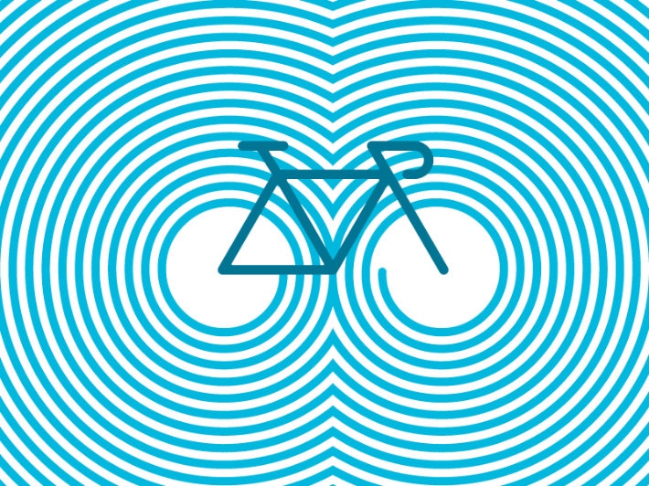
On an image of a kid riding his bike, for example, you can blur the rest of the image around him to show that he’s just whizzing by everything he passes. You can also use motion lines, as well as wave effects. You can also use opacity to give the optical illusion of movement, as with this logo designed by Vladimir Mirzoyan above.
Depth

Sure, flat designs have been all the rage for a couple of years now. You have to admit though that adding depth to some of your designs still fits better. After all, how amazing is it that something physically two-dimensional can actually seem like it’s popping right out of a page?
There are several techniques you can use to create depth in your designs, such as:
- Shadows
- Overlapping
- Playing with perspective (results to a 3D effect)
If your design looks like it could use a little bit of life, try any of these approaches and see the image before you rise up from its surface.
Typography

You may have all the images, textures, backgrounds, and other elements of your design down pat, but if your typography needs some work, then your entire design is compromised. Typography is more than just font styles and font sizes. It also has something to do with scaling, spacing, color, and a lot of other basic design concepts.
As typography covers a lot of ground, you’d probably be more enlightened if you read these books on how to make your typography better.
Composition

Instead of being an element that stands alone, composition is actually a combination of some of the elements we discussed earlier. Scale, hierarchy, depth—all these and a lot more contribute to a design’s overall composition.
Composition, in its most basic sense, covers the overall arrangement of every single element of your design. Just imagine all the elements we’ve discussed—when mixed together, does the end result work or not? That’s how you measure composition.
20 different elements, 20 different ways to make or break a design. Always have a list of these elements beside you as you work and let it be your guide as you try to weave through the challenges that come with completing your next design project.
When you want all your design elements to load quickly and render perfectly, make sure you’re using the best possible WordPress hosting with WP Engine!
