


11 Web Design Trends for 2024
These eleven web design trends are sure to make digital waves this year
Web designers have a lot on their plates. They not only have to worry about the user experience and brand storytelling that goes into a website, but they also have to keep an eye on what’s resonating in the design world as a whole, as the motifs in interior design and fashion design will often crop up in their client’s requests.
For example, Y2K fashion has been back in-fashion for a couple of years, and now, it’s catching fire in the web design world, so Y2K design elements have made our list of trends below!
One of your most valuable skills as a designer is your ability to take popular styles and transition them into the digital world, giving clients a site with the look and feel they imagined while simultaneously adhering to the best practices of modern web design.
Stay ahead of the curve and continue building the highly creative designs your clients have come to expect by trying your hand at one or more of the following 2024 trends!
- Y2K Aesthetic
- Lightning-fast Irregular Scroll
- Voice User Interface (VUI) Design
- AI Artistry
- Simple and Hand-drawn Elements
- 3D and Animated Product Reveals
- Brand-aware Google Maps
- “Music Festival Poster” Aesthetic
- Oversized, Animated, and Dynamic Typography
- The Return of 404 Fun
- Biophilic Design
Y2K Aesthetic
The average web designer is about 38 years old, placing them firmly in the Millennial generation. And because Millennial fashion is making a comeback, it makes sense that designers are also drawing on their childhoods for web design inspiration.
Bright, bold colors; large, simple geometric shapes; neon gradients; glossy, reflective, glittery, or metallic surfaces; pixelated art; and futuristic elements are some of the basic building blocks of this style, and you can use them to create a sense of nostalgia or whimsy in your designs.
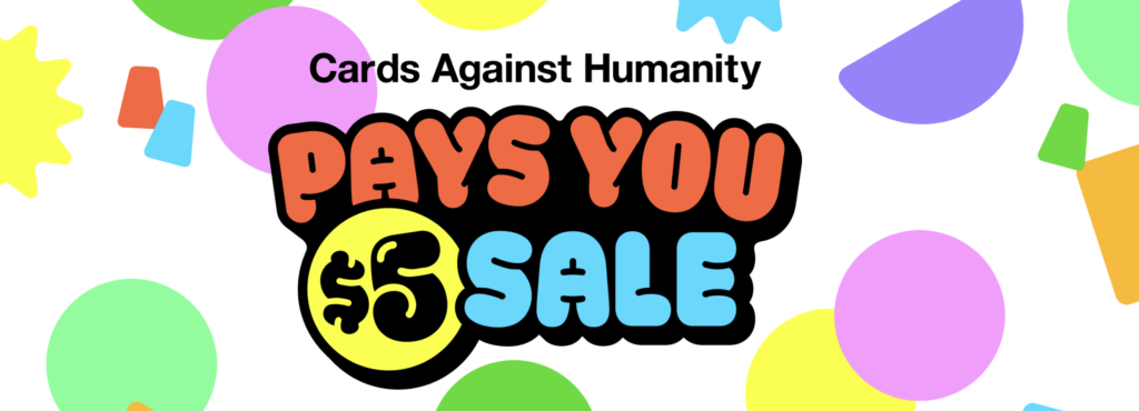
For example, this year, Cards Against Humanity won a Webby Award for their “Cards Against Humanity Pays You $5” campaign site. It’s a silly site full of funny challenges that Cards Against Humanity promised to pay its visitors to complete.
All the challenges have either been completed or timed out, but you can still see the site for inspiration here. The large, colorful shapes in the background and big bubble letters really add to the Y2K aesthetic.
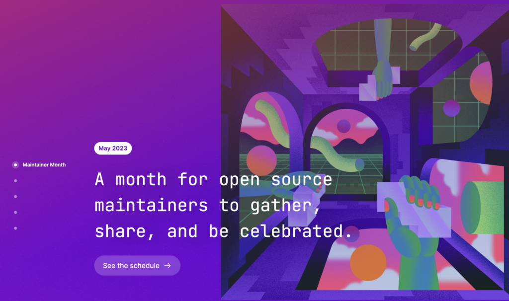
Maintainer Month, an initiative by GitHub, also uses the Y2K aesthetic on their site, with bright gradients and futuristic elements used as motifs across the single-page site. It was also recognized by the Webby Awards as an honoree in the Events subcategory this year.
Lightning-fast Irregular Scroll
Everyone wants engaging site animations, but no one wants slow animations. More than ever, users are demanding dynamic transitions that also keep up with the speed of scroll.
Whether your scroll moves side to side or you choose an entirely new and dynamic path for your users, the key to any good scrolling experience is ensuring it keeps up with your end user.
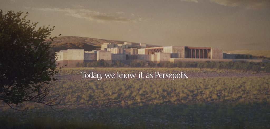
A great example of an irregular scroll that keeps the user experience interesting while maintaining speed is Persepolis Reimagined, a 2023 Webby Winner, which invites users to travel back in time as they scroll to explore Persepolis, the ceremonial capital of the Achaemenid Empire.
Throughout the virtual tour, the site provides additional context to the history of the structure and opportunities to look at the modern-day ruins juxtaposed with a designer’s reimagining of what the structure may have looked like between 550 and 330 BC.
On the mobile version, you can even take a 3D look around the area to immerse yourself in the experience!
Another, simpler example of effective irregular scroll was used by the creators of the Food Preferable Futures website. Scrolling through the Webby-honored site, visitors’ visual experience is zoomed in and out and transformed as they move through the page to ensure they remain engaged from start to finish.

Voice User Interface (VUI) Design
More and more, people are talking directly to their devices. Whether they’re saying, “Hey, Siri,” “Hey, Google,” or “Dangit, Alexa, I wasn’t talking to you,” the phenomenon is growing, and site designers are adapting with the use of Voice User Interface (VUI) design.
While VUI design is not new, its use across websites—especially for large enterprises with their own apps—will likely grow in 2024.
Android Auto and Apple CarPlay are both great examples of VUI design, especially because two of the most popular reasons users choose voice commands are to answer common questions quickly and go hands-free while driving, cooking, or completing another task. VUI technology is also great for accessibility, making it easier to bridge the gap between users with limited motor function and their devices.
However, it’s essential to do your research and make sure you have a great case for a VUI before spending the time to implement it in your design. Sometimes, companies jump on a trend before taking the time to decide whether it’s really necessary, and that can create unnecessary work for designers and development teams.
For example, both PayPal and CapitalOne introduced VUI features back in 2016—PayPal included a Siri command and CapitalOne created a new Alexa skill for their app.
Now, just six years later, both companies have removed their web pages explaining those integrations (although you can still find the Alexa Skill Terms & Conditions page on CapitalOne’s website, so the feature may still be available).
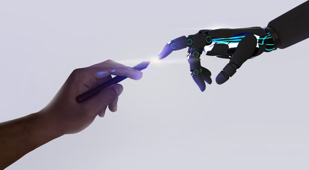
AI Artistry
Artificial intelligence has been the tech topic of the year, and for good reason. Recent advancements in AI have made it easier to ideate on copy, crank out code, and design inspiring images.
Whether you’re inputting a simple concept or attempting to turn the real into the surreal, the design possibilities of AI are endless. AI tools will be exceptionally useful for creating 3D elements and glassmorphic designs, two trends that have carried over from recent years.
Whether you’re using AI tools to create bits and pieces of a website or using it to build an entire site, designers are sure to embrace the power of AI in 2024.
Simple and Hand-drawn Elements
Conversely, the rise of AI is leading others to crave the simplicity of hand-drawn elements in static images, videos, and animations.
A little restraint can go a long way, and using more modest, straightforward elements as opposed to glossy 3D imagery will be a better fit for certain brands and businesses. Choosing one or the other will have a big impact on the overall feeling you’re trying to impart to your audience.
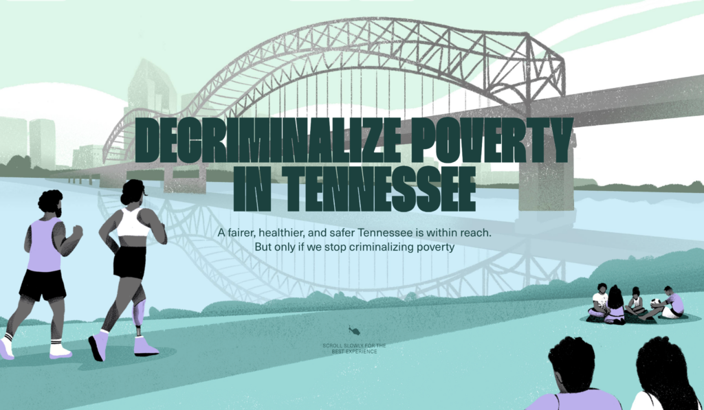
Another of this year’s Webby Winners, Decriminalize Poverty, uses a simple, illustrative style (as well as a lightning-fast irregular scroll experience) to portray the humanity behind a systemic issue. The strong narrative along with scrapbook-style photos and simple illustrations does a masterful job of humanizing the issue for site visitors.
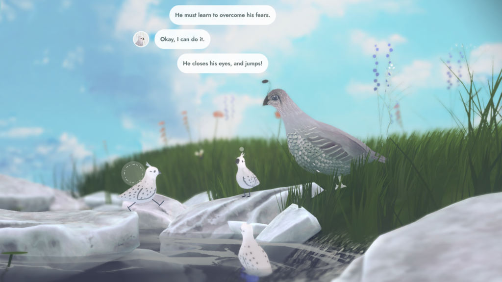
My Little Storybook, yet another Webby Winner, uses elements that look like handmade paper cutouts to tell the story of a little bird overcoming his fears.
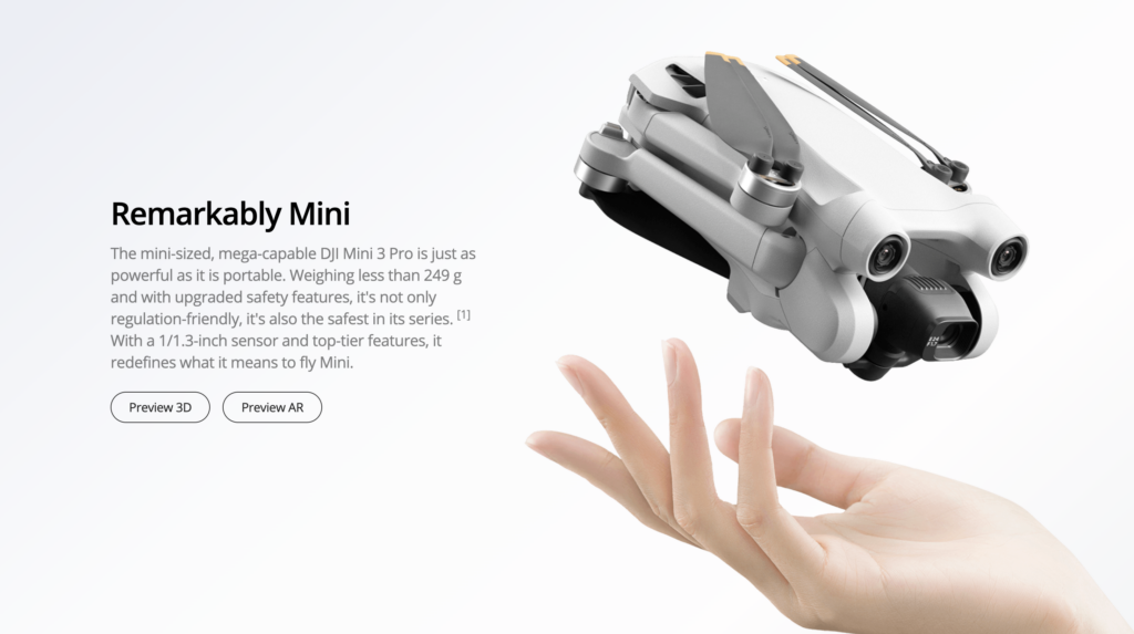
3D and Animated Product Reveals
What used to be the last slide in the Amazon listing is moving up in the world. Using video or 3D animation to view a product from all sides is becoming increasingly important as the options for online shoppers continue to grow. End users want to inspect products from every angle, and using video, animation, and 3D elements allows designers the flexibility to show off their client’s products in the best possible light.
Take this product page, for example. An animated 3D rendering of the DJI Mini 3 Pro drone rises, rotates, turns its camera, and disappears into a wall of text as users scroll, showing the drone from all sides, tapping into the irregular scroll experience we talked about earlier, and giving the end user a fuller view of the product than a simple image gallery could provide.
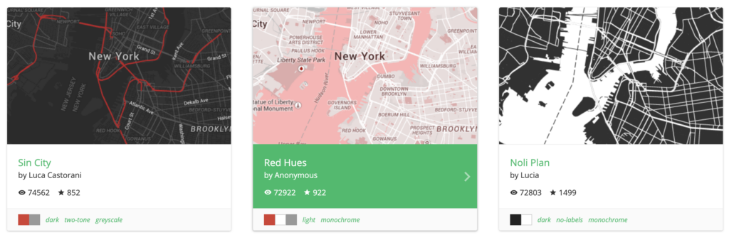
Brand-aware Google Maps
One element of design that even designers have had very little control over in recent history is Google Maps integration. You spend time building a beautiful site that fully embraces the brand standards of your client, only to plop an unbranded Google Map right in the middle of all your hard work. Now, designers are exercising more creative control over the look and feel of their clients’ maps.
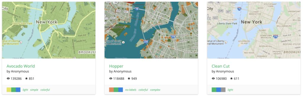
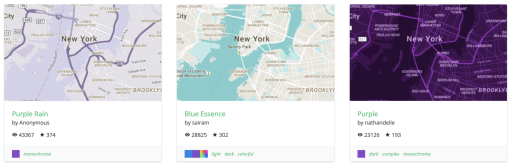
Using the Google Maps Styling Wizard, you can create maps using your own color scheme. Plugins like Snazzy Maps are making this trend even easier for WordPress users, simplifying the process of finding a Google Map style that matches your site’s existing branding.
“Music Festival Poster” Aesthetic
This trend has cropped up on several trends lists under a number of names, but truly, the best way we can describe it is “music festival poster-style web design.”
Other lists may call this style “extreme design” or “overstimulated branding,” and the hallmarks of the style include having lots of colors—maybe even with different fonts, patterns, or borders—all on a visually busy background.
Consider these posters from Bonnaroo 2023 and Lollapalooza Chile 2023 as examples.
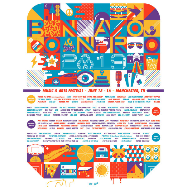
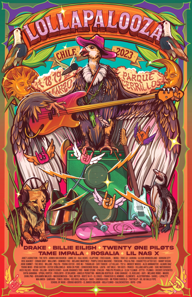
As you can see, the designs are erratic, exciting, and frankly a little overwhelming to the eye. There are lots of different colors and elements, and your eye moves quickly from one component to the next. This overstimulation is a great way to beat banner blindness, too, as a busy banner ad is more likely to draw attention than a simple design.
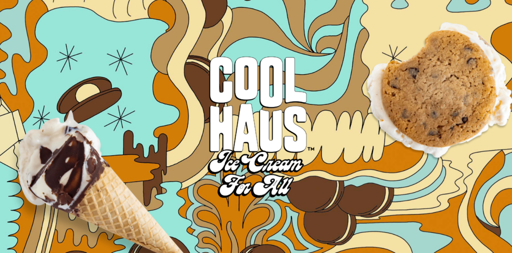
Now, head to the Webby-nominated CoolHaus ice cream website. There, you’ll see plenty of different colors and patterns (with some gorgeous scroll effects adding to the overall impression) as well as at least four different font styles, and that’s just on the homepage.
The Adidas “Here to Create” campaign is another solid example of this style. Exaggerated, colorful, cartoonish elements draw attention quickly and capture the feeling of love for sport that resonates with many soccer fans across the world. Check out the campaign video above to see how they infuse this style into their work.
Oversized, Animated, and Dynamic Typography
Some say a picture is worth a thousand words. These designers say, “A word is worth a thousand pictures.” Oversized, animated, or dynamic typography—or any combination of the three—will continue to trend in 2024.
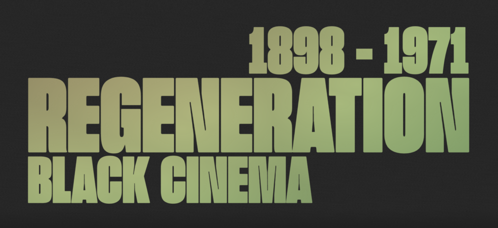
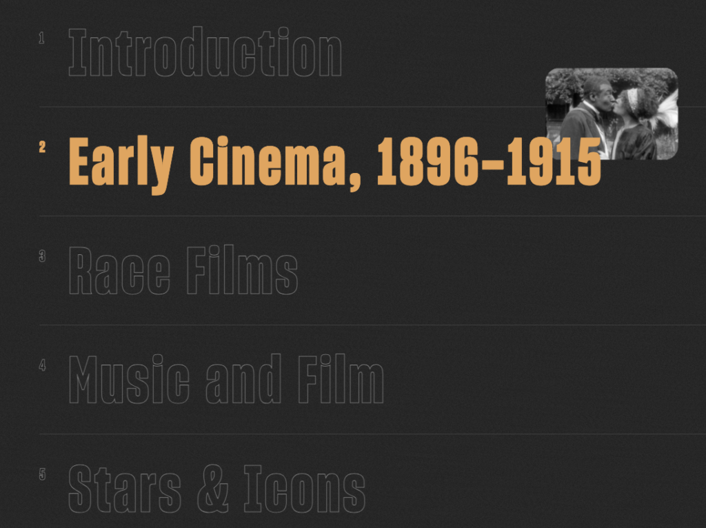
A great, Webby-winning example of oversized, interactive text comes from Regeneration Black Cinema. This project (and Crafted With Code participant), shares the history of Black Americans’ participation in cinema.
The page opens with oversized title text, and upon scrolling, users can engage with even more oversized text which has been treated with hover animations for some interactivity.
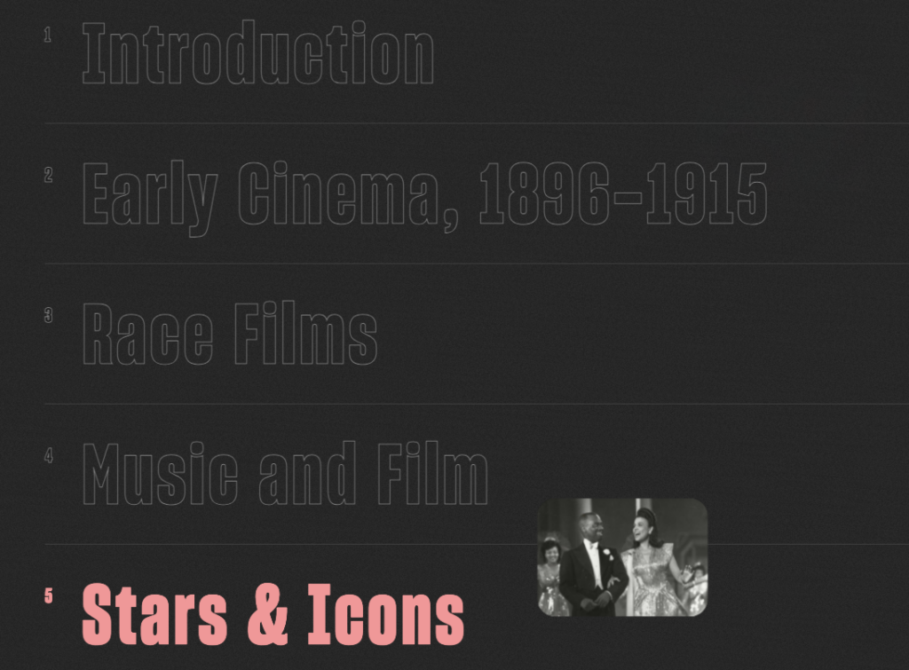
Another Webby-award winning project that relies heavily on the use of oversized text is No Web Without Women.
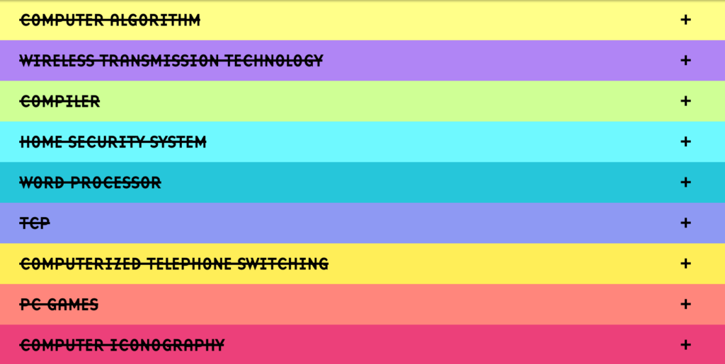
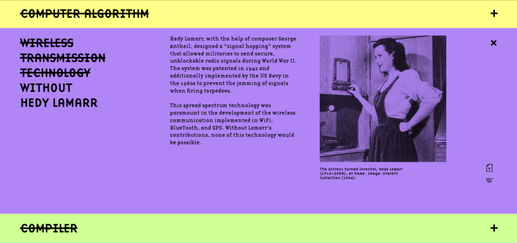
This site shares the history of iconic women who changed the trajectory of the technical landscape. The simple, yet effective, accordion-style layout shows multiple sections, each labeled with text that has been stricken through, subtly indicating that these advancements would not exist without the input of women.
The Return of 404 Fun
The idea of a fun 404 page has made and fallen off of trends lists over the years. Some see a fun 404 as a cheeky way to apologize for an inconvenience, while others decry them as too dismissive of such an annoying issue.
In 2024, the pendulum is swinging decisively toward whimsy as fun 404s are back on the rise. Site creators are building mini-games and interactivity into their 404 pages to turn an irritating issue into a fun side quest!
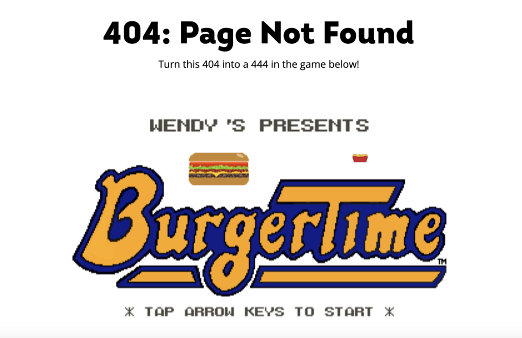
One of the best examples of this comes from Wendy’s. Their 404 page presents you with an interactive game in which Wendy has to navigate a course and build a cheeseburger meal without being captured.
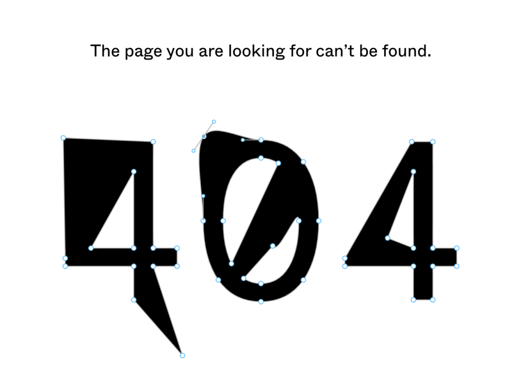
If you don’t want to build an entire game for users, a simple piece of interactivity can elevate your error page. Figma’s 404 page is an excellent example of a simple, interactive 404 page, allowing users to adjust objects as though they were actually editing them in a Figma board.
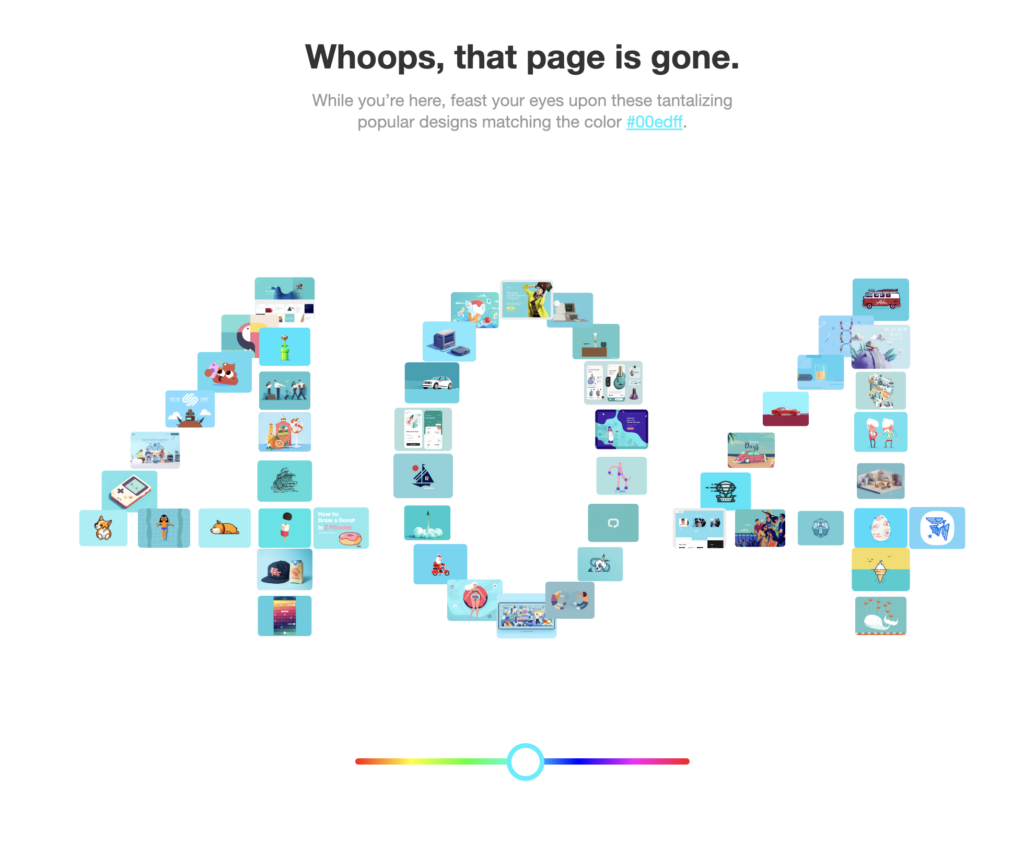
Dribbble is another great example of an interactive 404 page. Every time their 404 page pops up, images matching a particular hex code are displayed in the shape of a 404, and a color slider on the bottom of the page allows you to adjust the color you want to see.
Biophilic Design
Our last trend started in the wider world of interior design and has slowly trickled into recent web designs. Biophilic design simply refers to any design that brings in natural elements to create a sense of connectivity between design and nature.
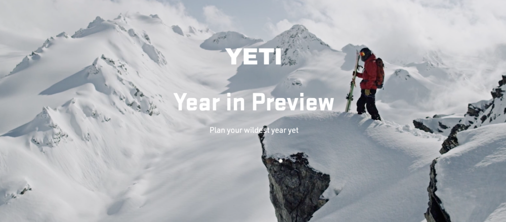
Yeti embraces this trend in their Webby-winning website, using video and still images of surfers, snowboarders, bull riders, and more as they embrace the visuals of the natural world, creating the sense that their product empowers adventurers to explore the outdoors.
It’s easy to understand how artists and designers can take inspiration from the natural world, and while images and videos of nature can help tell a brand’s story, designers should also consider the possibility of a more artistic approach.
For example, take a look at this biophilic design posted by 3D artist Rubén Pedrajas on Twitter.
He shows a masterclass in biophilic design with this fast-moving 3D rendering of a monstera plant, and it’s easy to see how something similar could be repurposed into a stellar website component for the right client.
Designing the Future of the Web
Web designers are the artists and architects of the modern age, building the beautiful online spaces users are coming to expect from the brands and businesses they trust.
WordPress powered by the WP Engine platform can provide the performant foundation you need to design your next masterpiece! Learn more about our options or speak with a representative today to unlock the full power of WordPress with WP Engine!
Start the conversation.