


Web Design Trends for 2022
If we’ve learned anything over the last two years, it’s that we’ll always have to keep adapting to something new. This is true in both life and design, and as we move into 2022, designers are beginning to embrace life’s chaos and express it through their designs.
Trends for 2022 are moving toward bolder, more creative, more interactive designs. Creators are leaning into a little more disruption and pushing the boundaries of what’s considered “good” web design.
Crank up your creativity in the new year by implementing a few of the trends we expect to see more of in 2022:
- Interactive Mini-sites
- Retro-inspired Designs
- Open Concept Designs
- More Customization
- 3D Objects, 2D Scroll
- Brutalism-lite
- Glassmorphism
- Creative Scrolling Effects
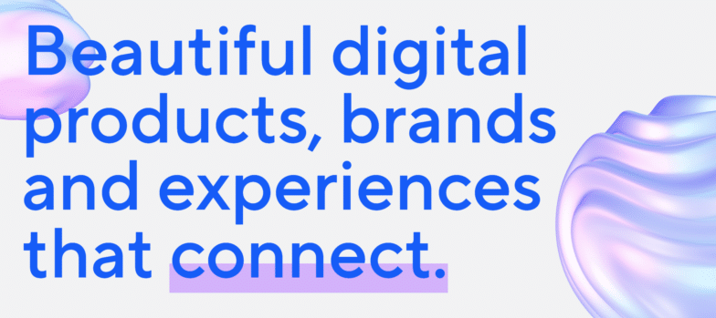
- Oversized Typography
- Visible Borders
- Collage Components with Abstract Visuals
Interactive Mini-sites
You’re great at what you do—show that off! Presenting your skills is a smaller, more controlled environment with highly specialized content and interactions is one way designers are attracting new clients. Show potential customers that you can create truly one-of-a-kind experiences by creating something simply for creation’s sake.
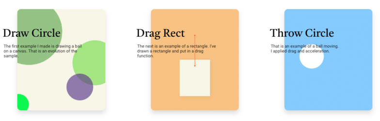
South Korean developer Jungik Lee created this mini-site that lets users complete one of three simple tasks. It uses a lot of color and simple directions to create or move different objects, and filling up a page with colorful circles is actually pretty amusing.
Amsterdam-based web designer Victoire Douy uses interactivity on her small portfolio site to capture your attention. Simply by moving the cursor, you can disrupt colors, tug on strings, move objects, and more.
Retro-inspired Designs
The average age of a web designer in the United States is 37 years old, placing them firmly in the Millennial generation. Because Millennials were the first generation to truly adopt the internet as daily users, it’s unsurprising that many designers are inspired by art, typography, and colors that were popular during the early days of the web.
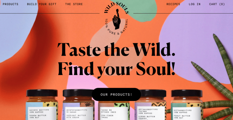
Wild Souls has an eCommerce site that pairs colorful shapes with an overlapping style to create a fun, vibrant aesthetic that’s befitting for the food company. They’re a retailer specializing in nuts, nut butters, honeys, and marmalades, and hover effects over their products add new textures and shapes that tastefully build upon the 90s-inspired visual themes throughout.
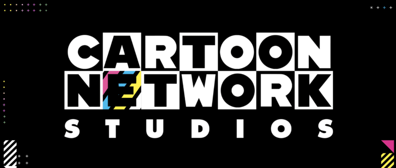
Cartoon Network itself is a brand beloved by much of Generations Y and Z. The studio’s website uses a black and white base paired with bold colors and delightful animations makes for a site that feels simultaneously retro and very on-trend.
Open Concept Designs
Maybe the pandemic is impacting our design preferences as well as our in-person behavior, because there’s an emerging trend of leaving lots of open space in designs. It might not be six feet, but designers are leaving a growing amount of space between sections, focusing on headlines, and sometimes scrapping hero images entirely, giving users plenty of room to breathe.
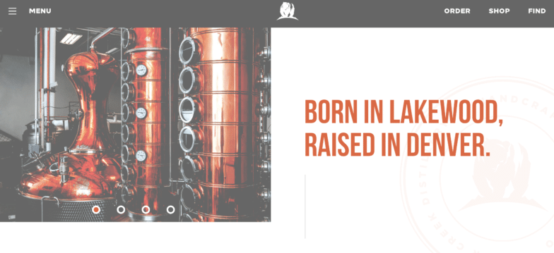
Spirits of any kind are sharp and crisp, and the website for Bear Creek Distillery in Denver, CO is also free from extra additives. Their website’s design concept is as clean as the vodka, bourbon, rum, and whiskey they refine.
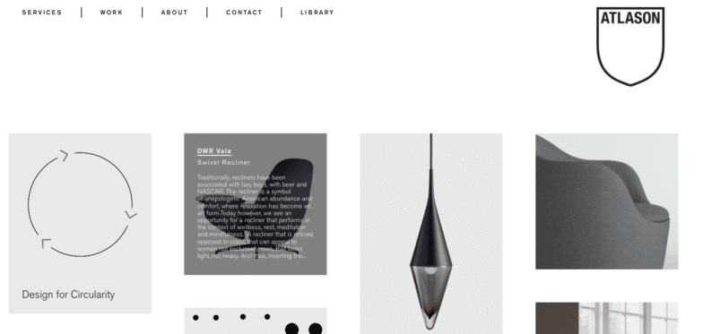
Atalson is a product and packaging design, material sourcing, and manufacturing company based in New York City. Sustainability is at the heart of their process, and the idea of clean manufacturing is mirrored visually on their site through the use of white space. This open space allows the products they’ve designed to hold the spotlight, while hover effects over the images express an overview of a product or an explanation of their company values.
More Customization
As users spend more of their time and money online, providers are finding new ways to appeal to wider subsets of their audiences. To do so, many are increasing the level of personalization available on their sites and apps, including vast improvements to inclusion features that go beyond the standard accessibility best practices all sites should be following.
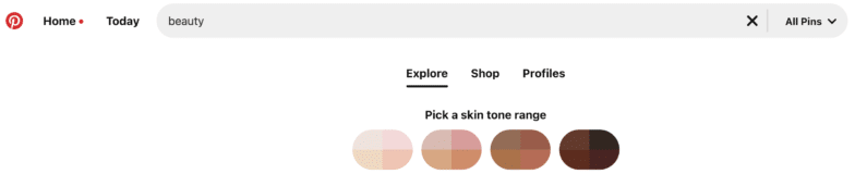
Pinterest’s “beauty” category is one of the most searched on the site, and the company recognized a need to be more inclusive to all of its users. Pinterest now creates faster, more personalized experiences in that category by offering a “skin tone range” feature. For many users, this is an answer to the oversaturation of lighter skin tones on the app, so all Pinterest users can find looks that work for them more quickly and easily.
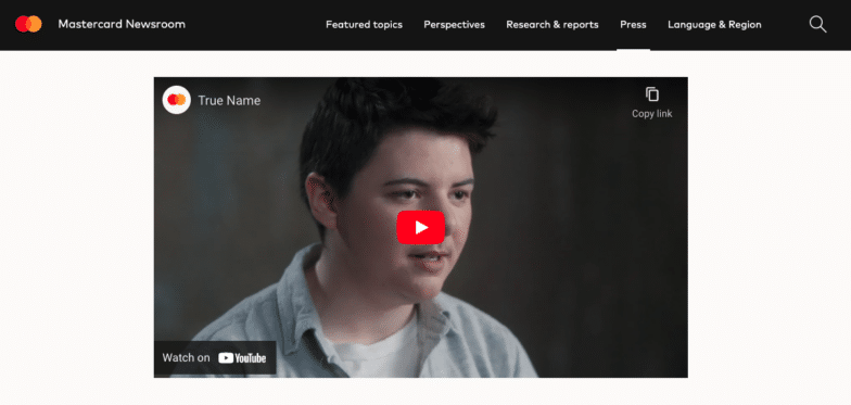
Mastercard has found a way to allow more of their cardholders to express their true identities during transactions by creating the “True Name” system. This allows trans and non-binary Mastercard holders to have their true names listed on their card instead of their deadname, regardless of whether or not their name has been legally changed.
3D Objects, 2D Scroll
Designs with 3D models and a flat, 2D content presentation look compelling and totally cohesive. Presenting easily digestible content in a predictable way with an interactive 3D element in the background is especially helpful when you’re helping your users better understand a physical concept.
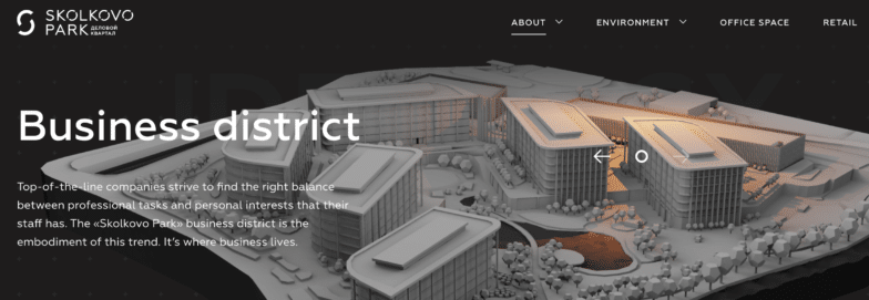
The website promoting this new business district near the heart of Moscow, Russia is a great example of focusing on a 3D centerpiece accompanied by simple, flat content. The homepage shows a moveable model of Skolkovo Park, but it doesn’t overshadow the prominently placed content.
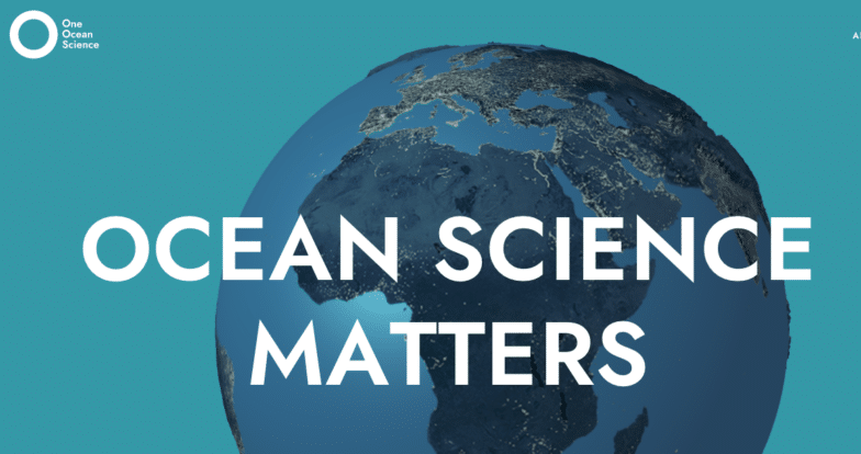
One Ocean Science is a knowledge-sharing summit aiming to connect global leaders in ocean conservation and research from a multidisciplinary perspective. Their website homepage welcomes you with a 2D scroll over a 3D model of the globe, which moves as you scroll, highlighting different areas and the research being conducted there.
Brutalism-lite
Brutalism refers to a very blocky, geometric, harsh style of art and architecture. In web design, this brash yet simple style stands out because it tends to eschew some of the traditional rules followed by websites in favor of minimalism. Often done in black and white, sites in this style feature few to no frills and bold text for a stark finish.
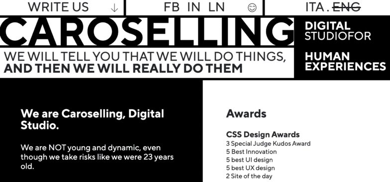
Italian creative agency Caroselling has a brand identity that’s all about being honest and upfront. They believe in setting realistic expectations, thinking through the ramifications of their strategy, and respecting the time and budget constraints of their clients. A Brutalistic site helps them illustrate their story as a no-frills, no-fuss agency partner.
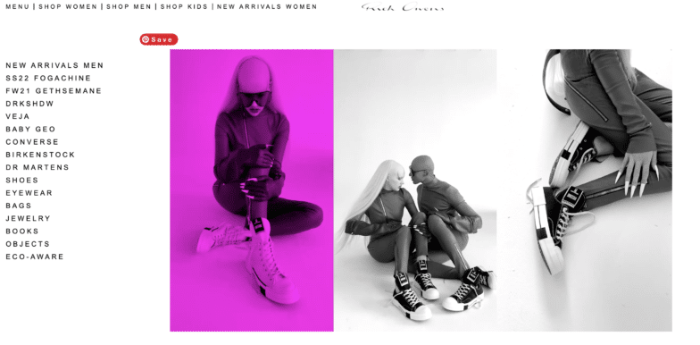
Paris-based, California-born designer Rick Owens once described his philosophy on furniture design as “a Brutalist fur on a Brutalist rock next to a Brutalist fire in a Brutalist cave.” On the website for his clothing and accessory lines, you’ll find no furniture—but you will find clear Brutalist inspiration in the imagery and layout.
Glassmorphism
Exactly as the name suggests, Glassmorphism is the art of making a screen look as if it’s made out of or covered by glass, typically used to blur a background on a user interface. In 2022, this trend should continue to grow in popularity as designers push front-end boundaries by creating glass-like animated objects and text.
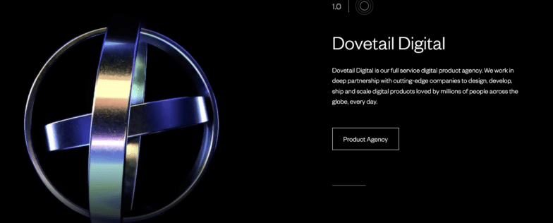
Digital product agency Dovetail Studios has animated this Glassmorphic set of nesting rings that spin at different angles. It draws the eye and shows off the 3D modeling prowess of their team. Other icons across the site also mirror this effect.
Another digital creative agency, Lo and Behold Studios, also uses animated Glassmorphic objects on their homepage. The lighter overall theme, however, gives their site an entirely different effect than a user would have upon viewing Dovetail’s.
Creative Scrolling Effects
Many designers are expanding on last year’s horizontal scrolling trend and are experimenting even further with scrolling effects. Whether it’s horizontal, side-by-side, or multi-directional, changing up the direction of your user’s journey through a site is an easy way to give them a more dynamic experience overall.
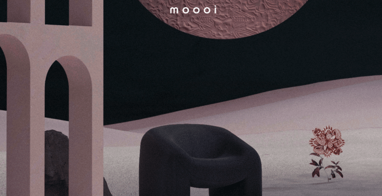
Dutch furniture company Moooi moves users deeper and deeper into their collections as they scroll. Their site offers three experiences: Beauty Blooms, Defy Gravity, and Paper Play. In each, the screen opens to reveal collection after collection, and you’ll dive into new patterns and vignettes as you scroll.
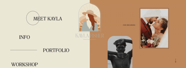
Kayla Fisher, a photographer whose site we’ve talked about before, uses a side-by-side scroll, keeping the menu sticky on the left side of the screen. This allows you to view her work in a visually engaging way without losing sight of the large buttons that compel users to dive deeper.
Oversized Typography
Your website should make a bold statement about who you are as a company. Many companies are taking this idea seriously by using oversized typography for headlines, or even in place of a hero image.
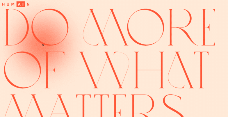
Technology research collective HUMAIN is working to bridge the gap between human experiences and technical innovation. Backed by the Cronos Group, their aim is to find new ways to use emerging technologies to enhance human experiences both online and in life. By using text in place of a hero image, this company with a complicated story shouts their mission from the moment you enter their site.
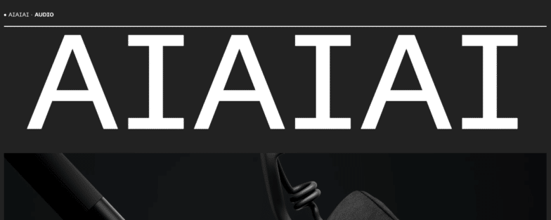
When you think of headphones, the ideas that come to mind are as much auditory as they are visual. Headphone company AIAIAI’s name is as much an exclamation as it is a name, and it screams a bold statement to users who visit their site. The large text introduces the company, followed by a smaller, hero-adjacent video just below the fold, disrupting the traditional pattern of hero image then text.
Visible Borders
Visible borders give structure to your design and draw your users’ attention through your content. Using just simple lines, borders can help you when designing for clients who need a neat, tidy site. On the other hand, a fun, funky, interactive border can create additional visual interest for your online visitors by using bold colors or interactive effects.
Independent agency Bonjour Paris pairs visible borders with a horizontal scroll so the site is minimalistic but still has lots of intrigue. The linework borders continue across the site to their project section, where they take on new shape without looking ambiguous or busy.
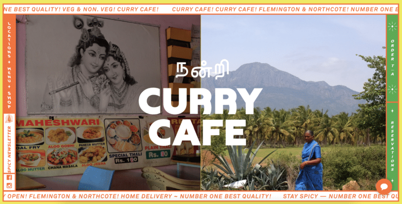
Australian restaurant Curry Cafe has two locations, and their site’s scrolling border provides a solid framework through which users can consume the rest of their highly colorful and engaging content.
Collage Components with Abstract Visuals
We’ve come a long way since the start of the web. Where some designers are embracing structured aesthetics, others are moving in the opposite direction. Bold colors, overlapping images, and multiple textures can all come together seamlessly when each of the elements is thoughtfully designed.
Illuminating Radioactivity is an educational website created collaboratively by the Stimson Center, the Reinventing Civil Defense project, and the Bombshelltoe Policy x Arts Collective. It recounts the history and meaning of the word “radioactivity” and our associations with it, as well as the ways in which it has played a part in science, entertainment, medicine, and more. As you scroll, you’re inundated with old pictures that help to tell the history paired with bright, abstract shapes.
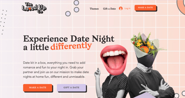
Australian company The Loved Up Co helps spice up date nights with handy kits that provide everything you need for a night in with your partner. Their homepage features collage-style people in which the bodies are taken from black and white photos and the heads are superimposed with smiling mouths, flowers, and cocktails! Abstract shapes, circles, and squiggles appear throughout the design to continue moving the eye through their content.
Designing the Future of the Web
Keep an eye on these trends, and try out a few concepts that grab your attention. If your trend-tracking eye is keen, you may have even noticed that some of the web design trends in 2022 are extensions or permutations of last year’s trends.
See some you love? Something we left out? Let us know in the comments below and remember: Styles that are here to stay and those that are passing fads all depend on what designers like you decide to create with your clients this year!
Start the conversation.